
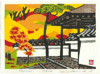
I would like to share this beautiful little print and try to uncover some of the techniques used in it. If you click on the thumbnail you can see an image that is close to actual size.
The print was issued in 1975 with a small German museum catalogue in an edition of 1000. Hashimoto (1899-93) was 75 and still going strong. He has a free flowing carving style and here he makes his 7 blocks in a rather relaxed manner. Small irregularities remain where they add to the feel of the print. The colours overlap generously. he uses a watery ink, probably without starch, to get his neutral tones. The brown on the temple roof may have been wiped from the block to show the grain of the block. The grey sumi is very soft with a nice ito-bokashi along the bottom of the brick work seen in the white wall. The black ink is printed over the colour in most parts, with only the red partly removed, it also has mica added to give just the occasional glimmer of light. The colour is superbly balanced, with beautiful vibrant shades nestled in with the black.
Any other comments about this print, or the Hashimoto style? Tom
I like this image very much, the vibrant colors used on the background, trees and leaves make great contrast to the otherwise plain & colorless building. The free style seems very similar to 20th Century artists like Sekino, Saito and others.
ReplyDeleteTom, can you tell if the pigments used were opaque or transparent ?
Julio,
ReplyDeleteThis print is on a thick washi with rich colour showing on the verso and lots of small baren marks. It is moku hanga, the colours are transparent and even the black does not quite hide the colours underneath. Where the colours overlap there is a pleasing border created.
Hashimoto was a friend of Un'ichi Hiratsuka (1895-1997) and his carving style is influenced by him. Hiratsuka was trained in the exacting shin hanga style and took his expertise to share with the artists making creative prints, sosaku hanga. The new style was far more spontaneous, the carving tools used expressively.
With the neutral tones Hashimoto has used printing techniques explored by Kiyoshi Saito, laying down a very thin ink onto a rough block then overprinting patterned shapes, as in the temple roof. Saito was less adventurous with colour. Other artists like Sekino made brightly coloured prints and it is interesting to see how the colours reflect the style of the decade. In this print the burnt orange flavour is very 1970s.
Hashimoto was fond of making prints of castles and gardens, in this print he has combined the two as a demonstration of his style. The print was reproduced on the cover of the catalogue and I think Hashimoto made a special effort with this print.
Here is a google image search showing more Hashimoto prints:
http://images.google.com.au/images?q=hashimoto+okiie&hl=en&btnG=Search+Images
Tom, it seems that you love sosaku hanga as much as I do! My love for it is naive, though, since I still don't have a deep enough understanding of the medium to assess it the way you do. So all I can say about this print is "I really like it." Thanks for posting it. I enjoyed seeing your "36 views of Green Island" - lovely work.
ReplyDelete